View List
List views allow you to create custom list views. Lists can contain as many items as desired, several options are available for each item:
- With or without icon
- Primary and secondary text
- With or without content on the right
Icon
Allows to display or not an icon. Many integrated icons are available but it is possible to use an icon from the Micro SD card. The resolution of the icons must be 48 x48 and be in PNG or JPG format.
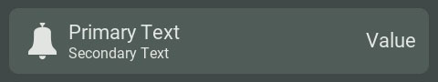
Primary and secondary text
It is possible to customize a primary text and a secondary text. The primary text is typically used to display the name or information type, while the secondary text provides additional or contextual details.
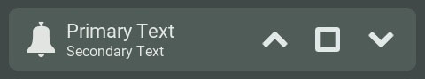
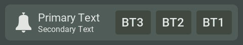
Content on the right
The content on the right can be disabled, text type or buttons. If it is button type, there can be up to 3 buttons and these can be square or transparent. For each button their contents can be text or icon type. Many integrated icons are available but it is possible to use an icon from the Micro SD card. The resolution of the icons must be 32 x32 and be in PNG or JPG format. An HTTP request can also be configured and a TCP event is sent for each buttons.