View list
Define parameters for views type list.
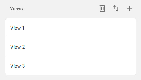
Views
List of created views. Each view can be duplicated or deleted by right-clicking on it.
General View Settings
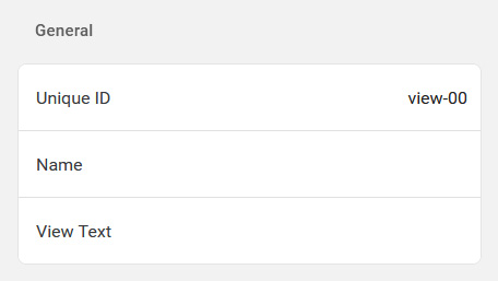
Unique ID
Unique identifier used to identify the view in third-party applications. If the unique identifier is changed, the settings of third-party applications will also need to be changed.
Name
View name.
View Text
Text displayed on the bottom bar of the view.
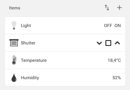
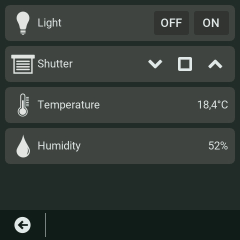
View Items
List of items in the view. Each item can be duplicated or deleted by right-clicking on it.
Elements have multiple parameters:
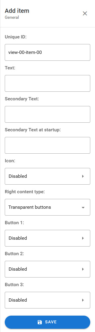
Unique ID
Unique identifier used to identify the item in third-party applications. If the unique identifier is changed, the settings of third-party applications will also need to be changed.
Text
Primary text of the element.
Secondary Text
Secondary text displayed below primary text.
Secondary Text at startup
Secondary text value applied at startup.
Icon
Allows you to display an icon or not. The icon type can be embedded or from the Micro SD card, the icon resolution must be 48 x 48 pixels and be in PNG or JPG format.
Right content type
Defines the contents on the right:
- None
- Text
- Square buttons
- Transparent buttons
Current Value
Value displayed when Right Content Type is set to Text.
Startup Value
Value applied at startup when Right Content Type is set to Text.
Bouton 1
Settings for the rightmost button 1. The Right Content Type must be set to Square Buttons or Transparent Buttons.
The button can be disabled or of type: text, embedded icon or custom icon Micro SD. The icon resolution must be 32 x 32 pixels and be in PNG or JPG format.
An HTTP request can be set that will be executed when pressed.
Bouton 2
Settings for button 2 located in the center. The Right Content Type must be set to Square Buttons or Transparent Buttons.
The button can be disabled or of type: text, embedded icon or custom icon Micro SD. The icon resolution must be 32 x 32 pixels and be in PNG or JPG format.
An HTTP request can be set that will be executed when pressed.
Bouton 3
Settings for button 3 located furthest to the left. The Right Content Type must be set to Square Buttons or Transparent Buttons.
The button can be disabled or of type: text, embedded icon or custom icon Micro SD. The icon resolution must be 32 x 32 pixels and be in PNG or JPG format.
An HTTP request can be set that will be executed when pressed.